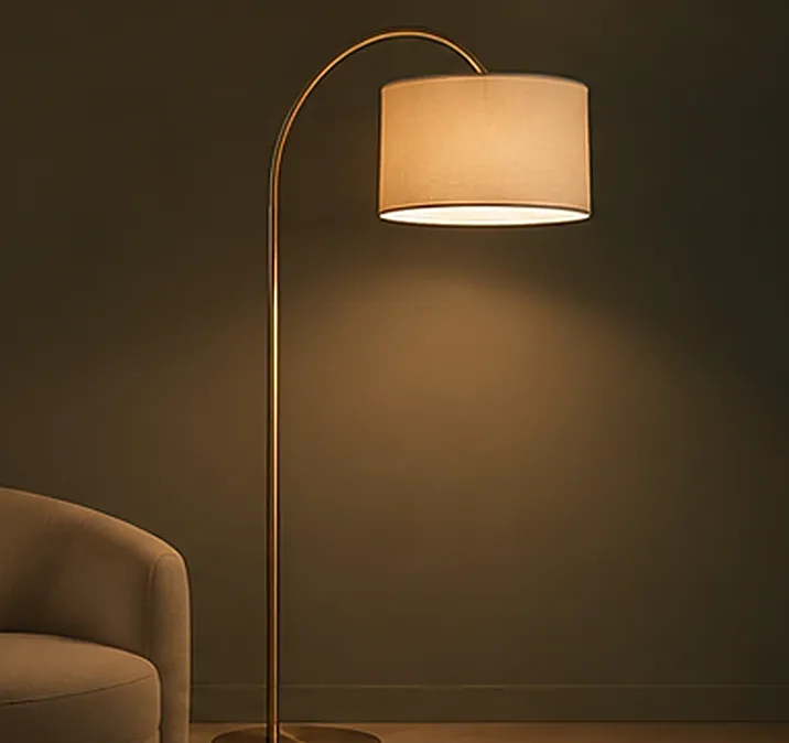
You can stand in front of two lights that look almost identical and discover that they make the same room feel completely different. One gives the wall a warm, welcoming appearance. The other looks crisp and neutral. A third feels cooler and more clinical.
The difference may be colour temperature, but choosing the right one is not simply a matter of deciding whether warm or cool is better.
What do those Kelvin numbers mean?
Correlated colour temperature, usually written as CCT and measured in kelvin (K), describes the apparent colour of white light. Lower CCT values tend to look warmer or more amber; higher values tend to appear cooler or more bluish. Common labels such as “warm white,” “natural white” and “cool white” are helpful, but the exact ranges can vary between suppliers.
For example, around 3000K is often described as warm white, around 4000K as neutral or natural white, and around 6000K as cool white. These numbers describe colour appearance—not the brightness of the light.
A 3000K light is not automatically dimmer than a 4000K one. Brightness needs a different measurement, and the way brightness feels also depends on optical design and the room.
Start with materials and mood
A home full of timber, warm fabrics and earthy stone may respond beautifully to warmer light. A practical work area with neutral finishes may benefit from a different approach. But those are starting points, not rules that every home must obey.
Hold real material samples under the proposed light. Cream walls can change character. Grey stone can look unexpectedly warm. Timber may appear richer or duller depending on the source and its colour rendering.
The useful question is: does this particular light help the room look the way you intended when the sun is no longer doing the work?
One colour temperature for the entire house?
Consistency can make adjacent rooms feel connected, especially where doors stay open and light spills between spaces. However, a home contains different activities. A bedroom, kitchen, wardrobe and utility area do not all have identical priorities.
Instead of imposing one number everywhere, plan an intentional relationship between spaces. Think about what people will see when they move from the living room into the hallway or kitchen. Abrupt transitions can feel more noticeable than small differences within a well-considered scheme.
Some products can switch between CCT settings, but that capability depends on the exact fixture and control system. “Tunable” should never be assumed from the category name alone.
Colour temperature isn't colour quality
Two LED fixtures can both be labelled 3000K and still render a red fabric, green plant or skin tone differently. Colour rendering matters. So do beam angle, glare, diffuser design and consistency between batches.
This is why comparing lights solely by watts and kelvin often disappoints people. If you're buying fixtures for an important finish or display, ask for the product's documented colour-rendering information and, where possible, assess a sample.
How to decide without overthinking it
Choose a room and identify its most important activities. Look at the dominant finishes and the type of atmosphere you prefer. Compare suitable samples in the actual space, preferably after daylight has faded. Don't judge a light from a phone photograph alone: camera exposure and white balance can change its appearance dramatically.
Then consider how the colour temperature works with other lights visible from the same room. The right choice is one you can live with comfortably, not necessarily the one that looks most impressive in a thirty-second demonstration.
Why comparing photographs can mislead
A phone camera automatically adjusts exposure and white balance. That warm café photograph may have been edited heavily, and a bright white-looking showroom image may not represent the actual source colour at all.
For an important finish, see a physical sample under the proposed light. Keep surrounding conditions as consistent as practical, including dimming level and the time of day. Compare more than one surface: a white sample alone will not tell you how timber, textiles and skin tones appear.
Good lighting doesn't begin and end with choosing between warm and cool. That choice matters, but it becomes truly useful when it supports a thoughtful overall plan.
Explore the lights: Architectural lighting
Have a lighting requirement? Ask us on WhatsApp.